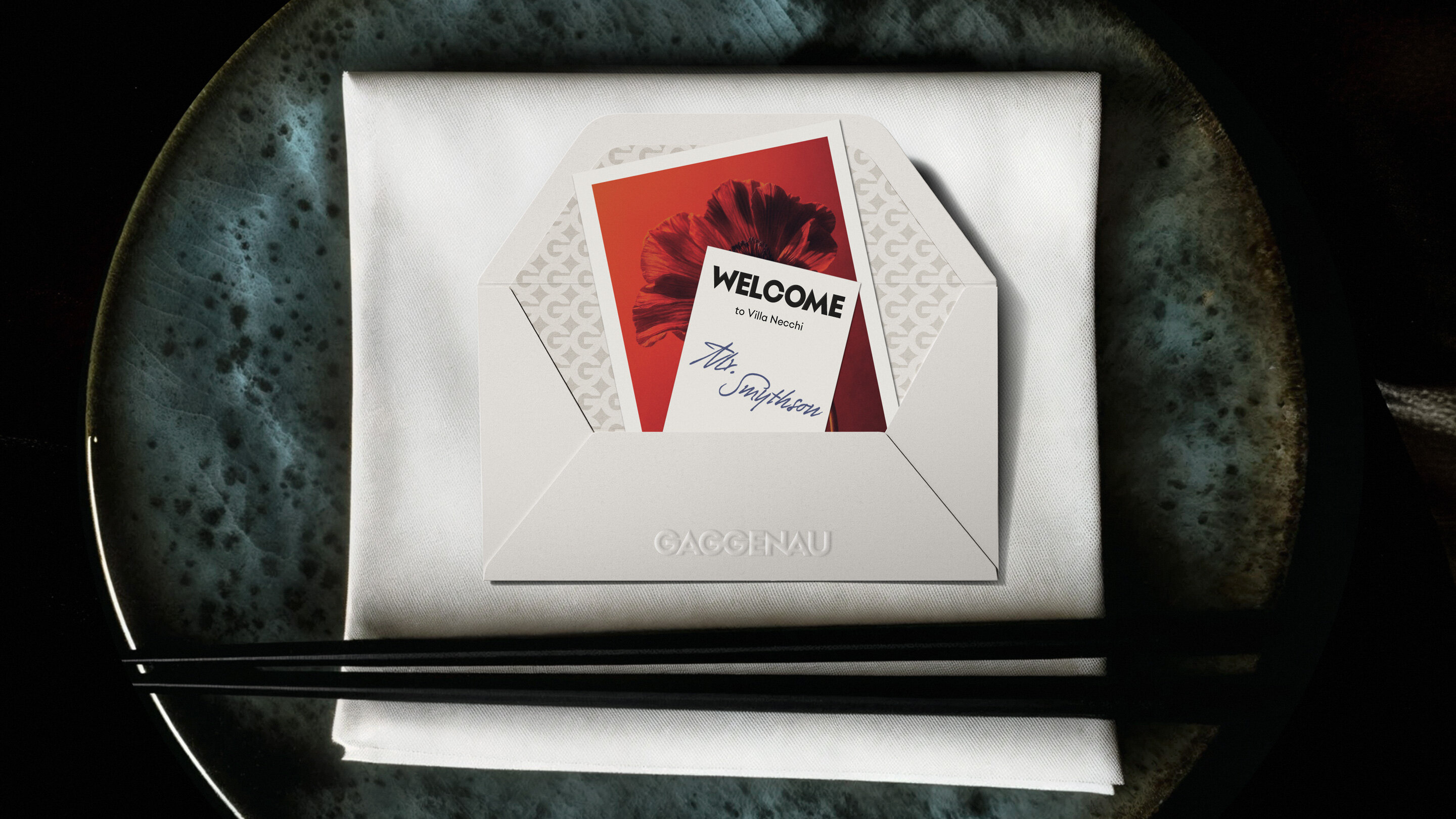
Making the difference for the luxury spearhead of the B/S/H conglomerate
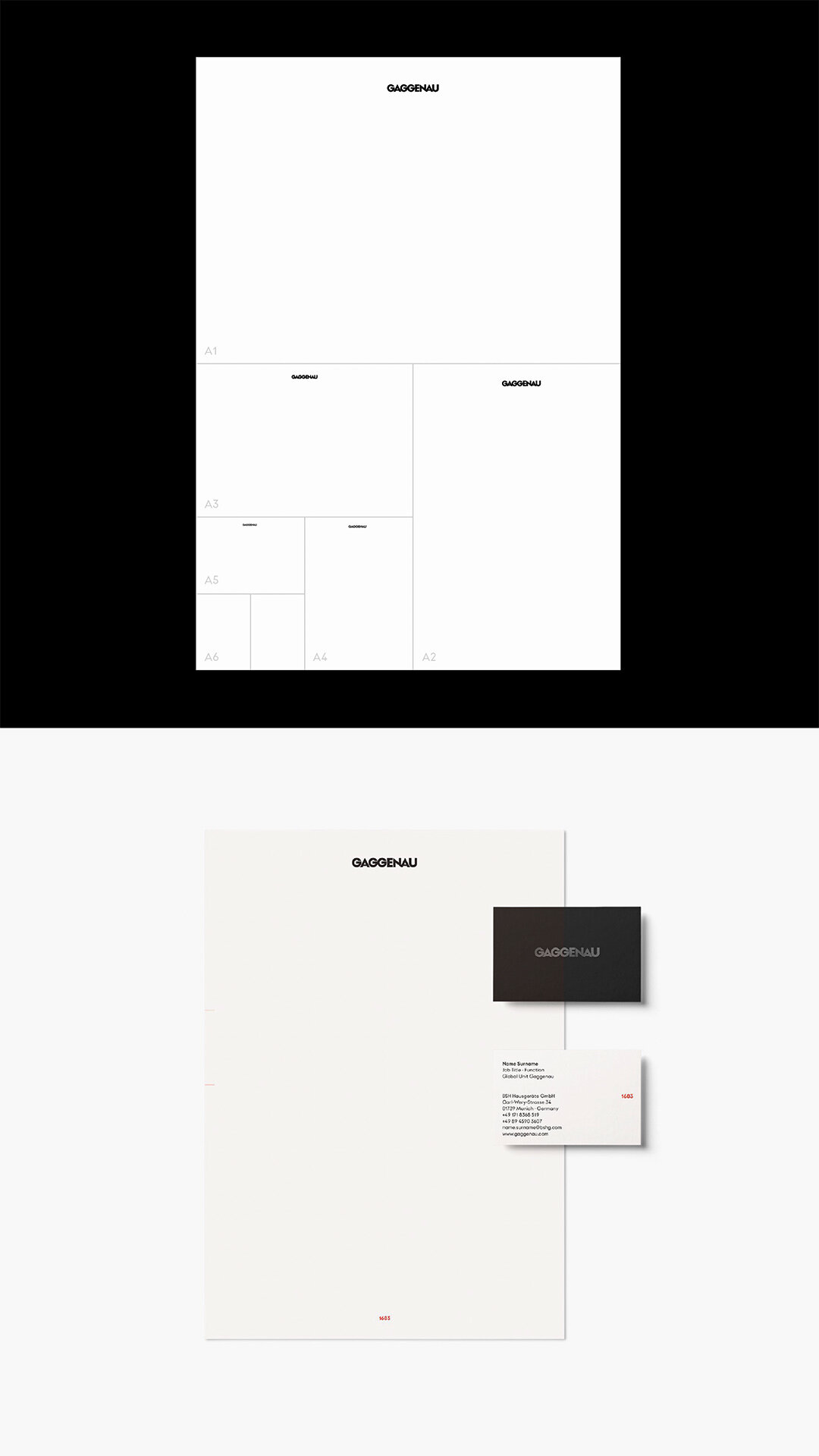
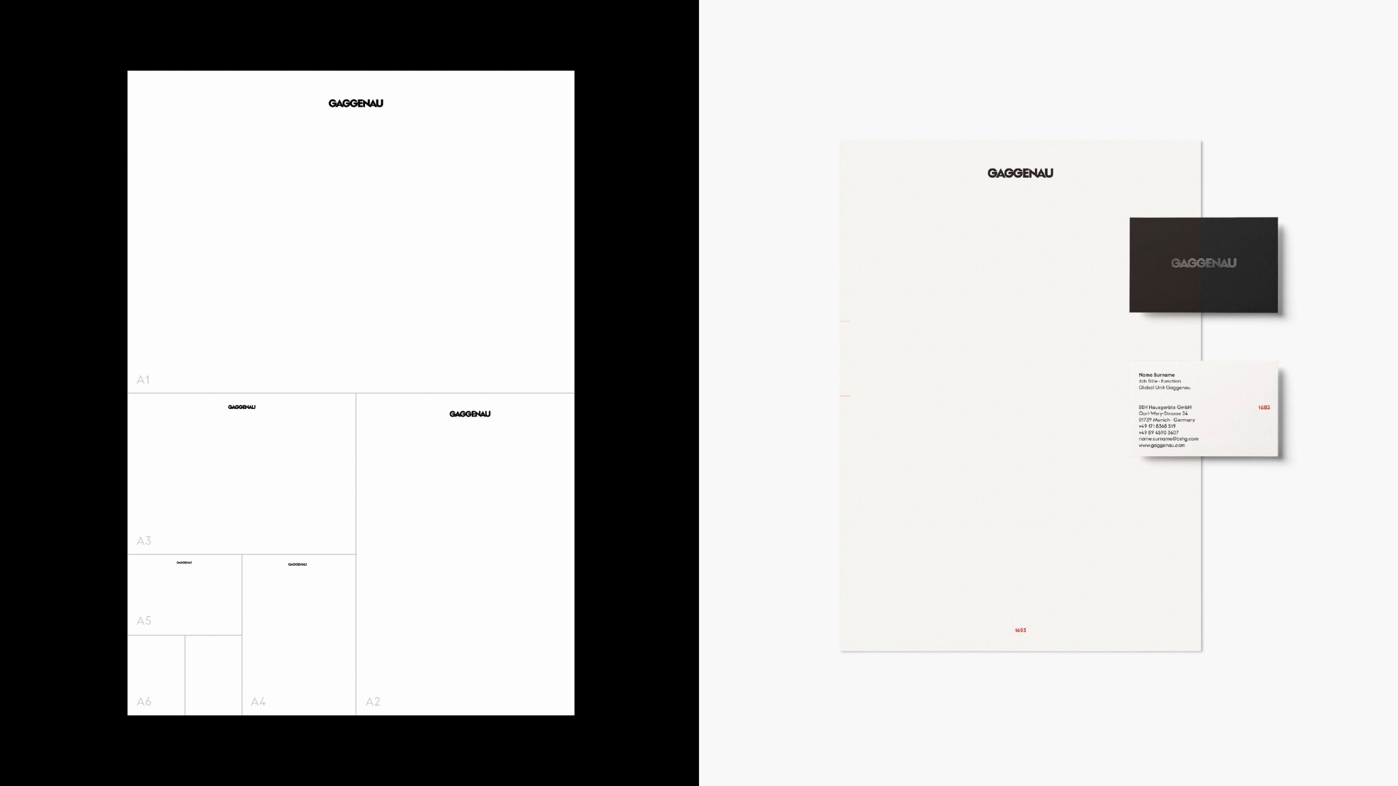
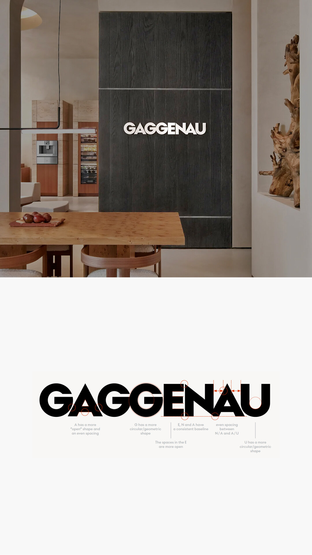
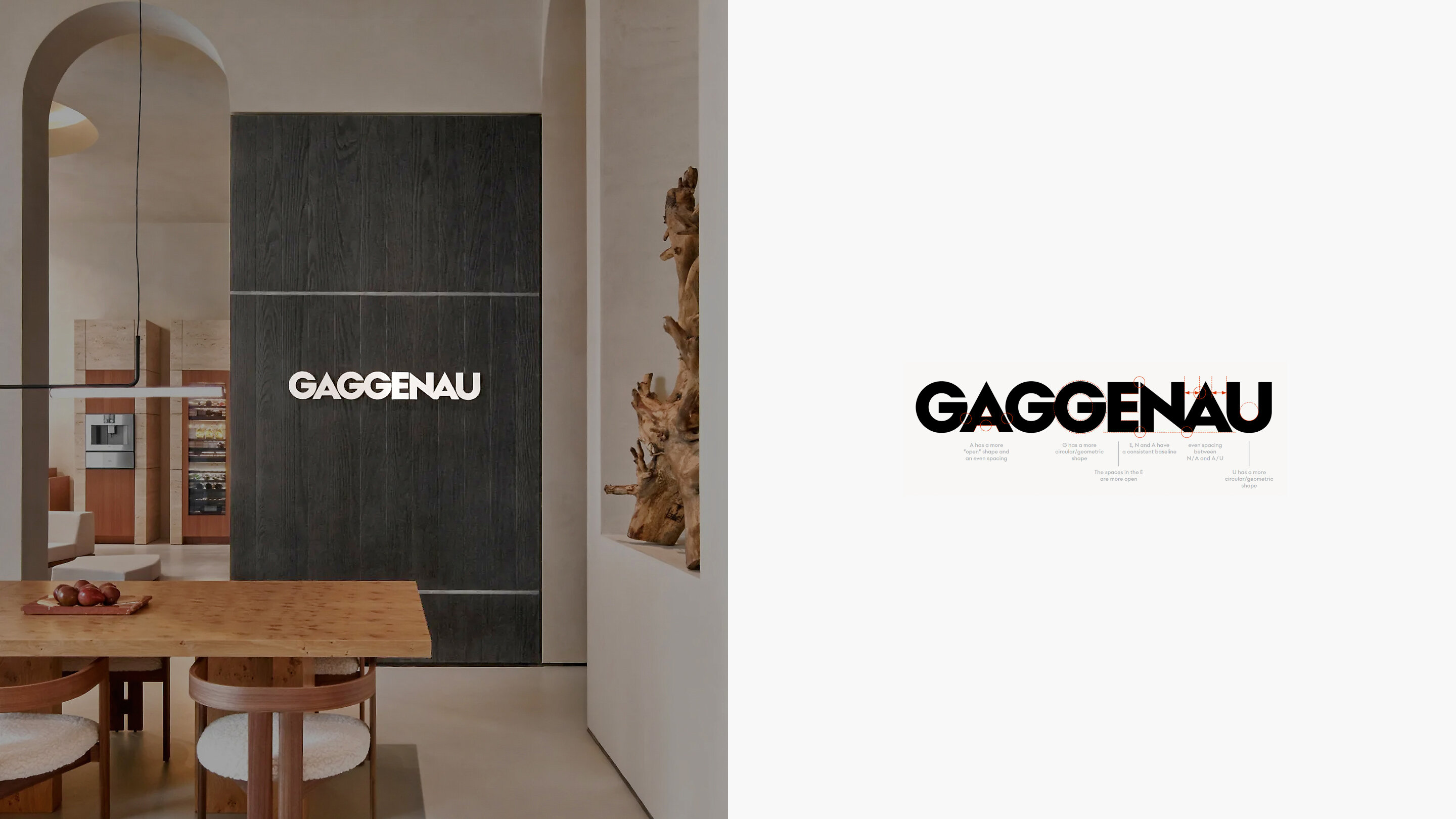
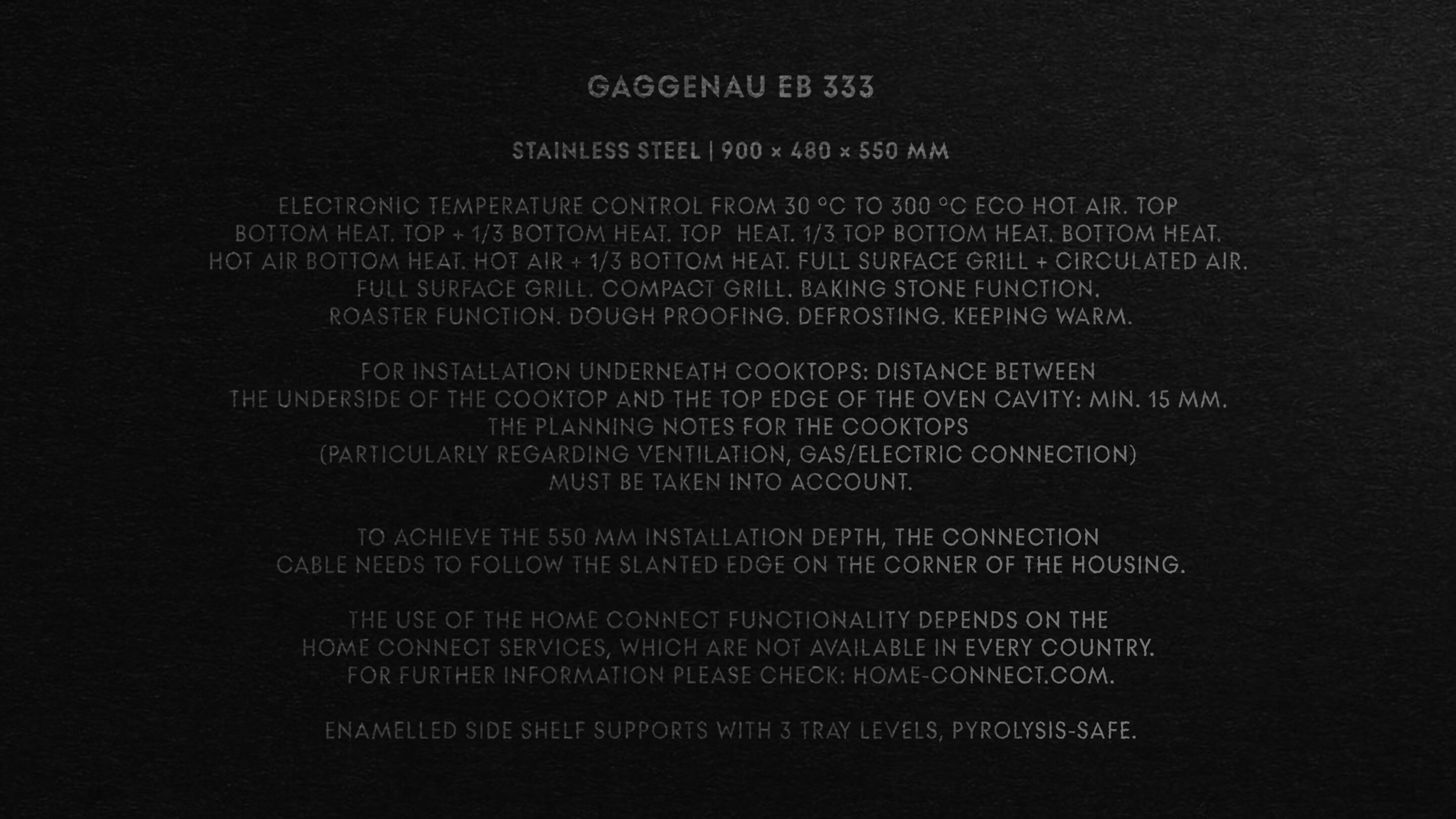
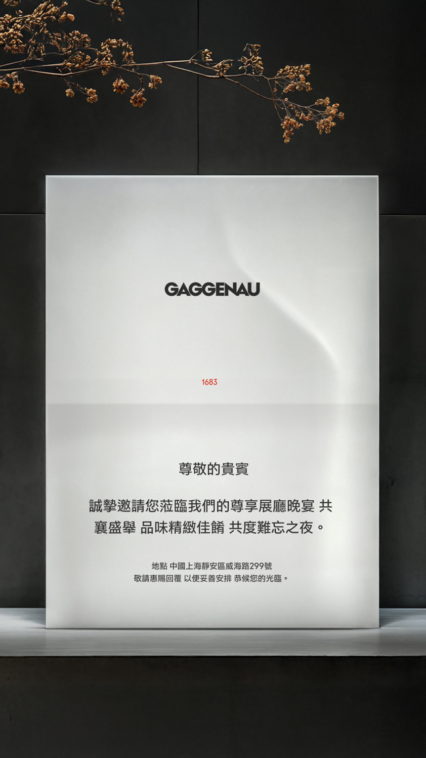
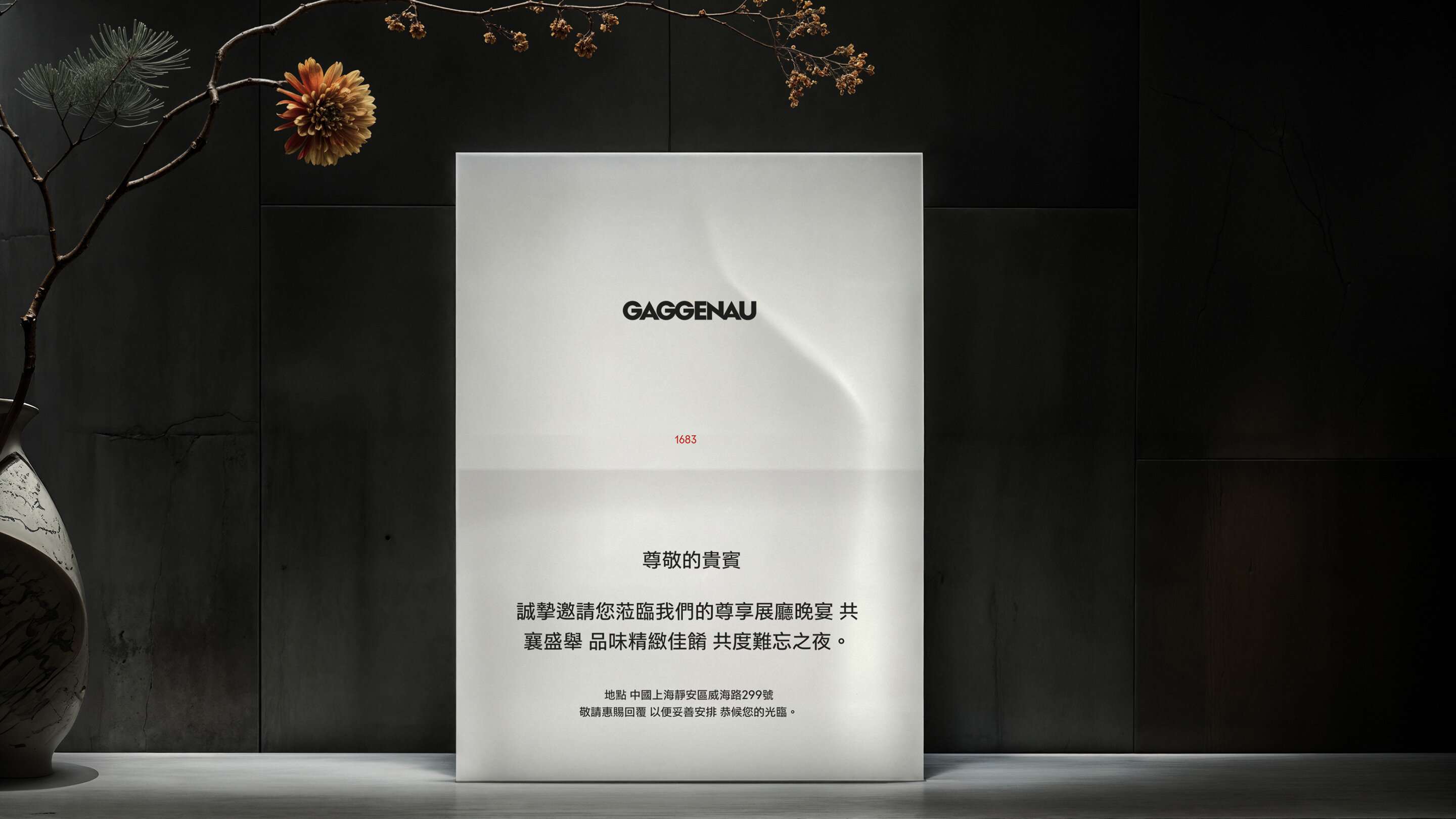
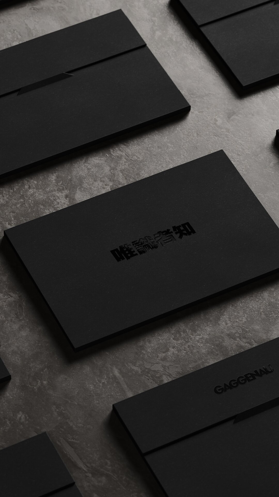
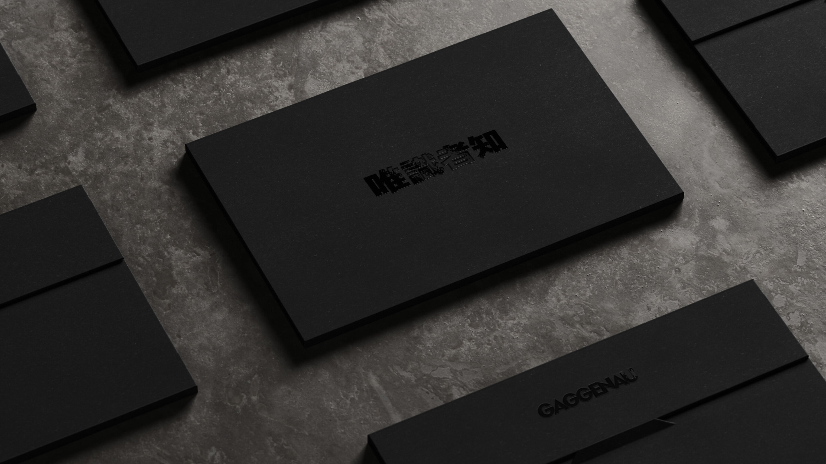
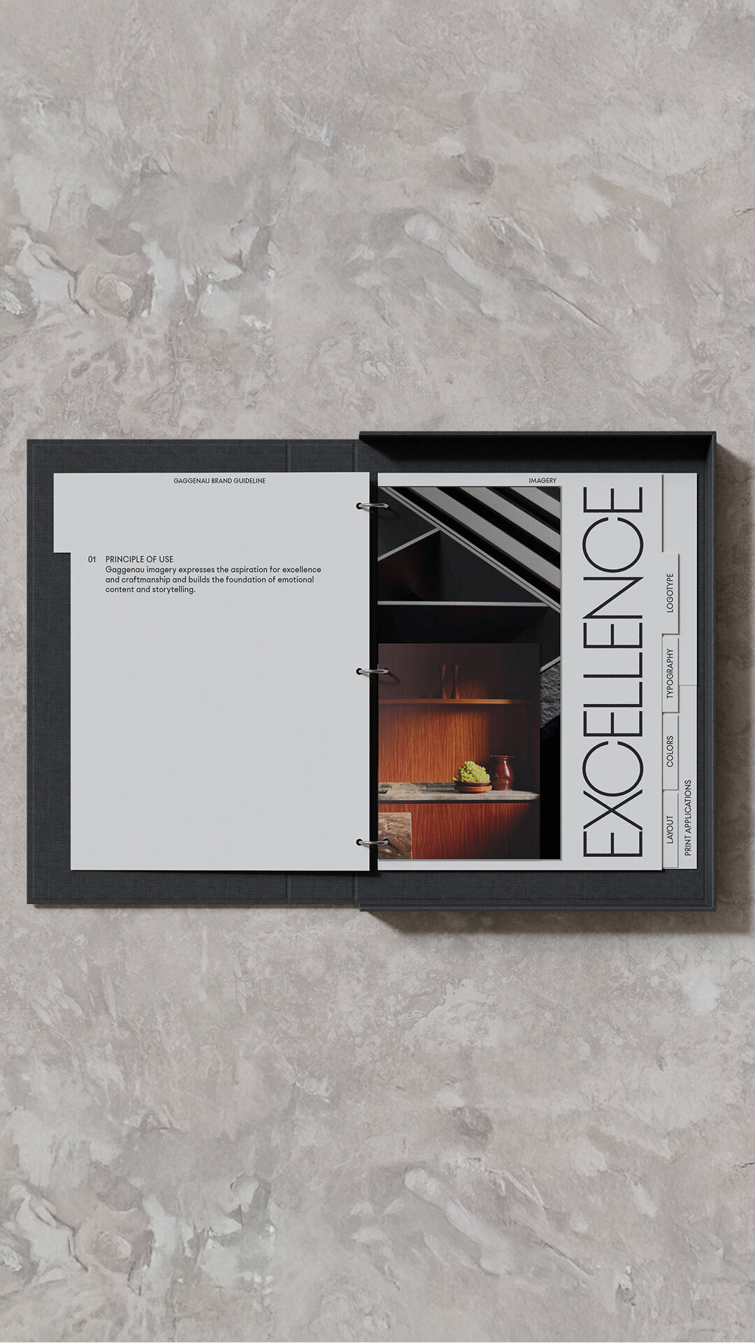
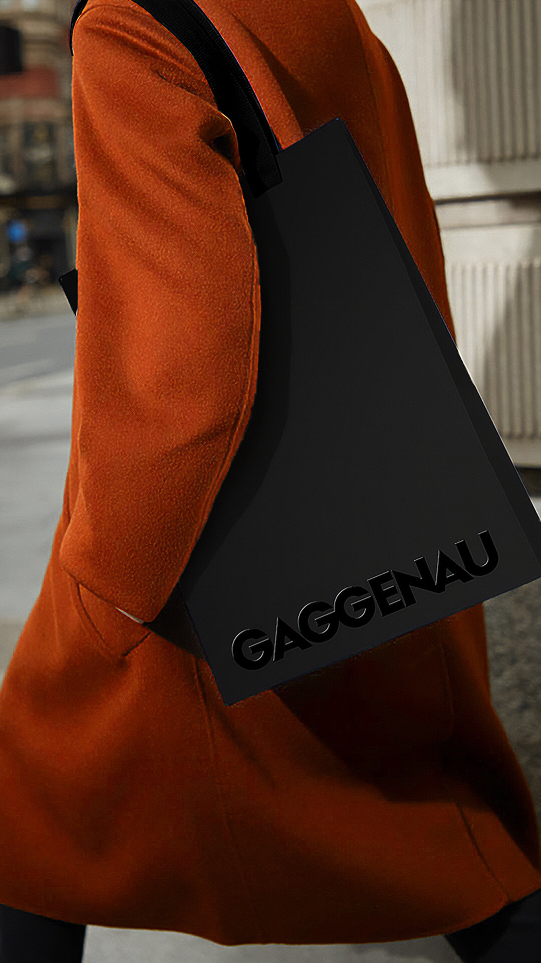
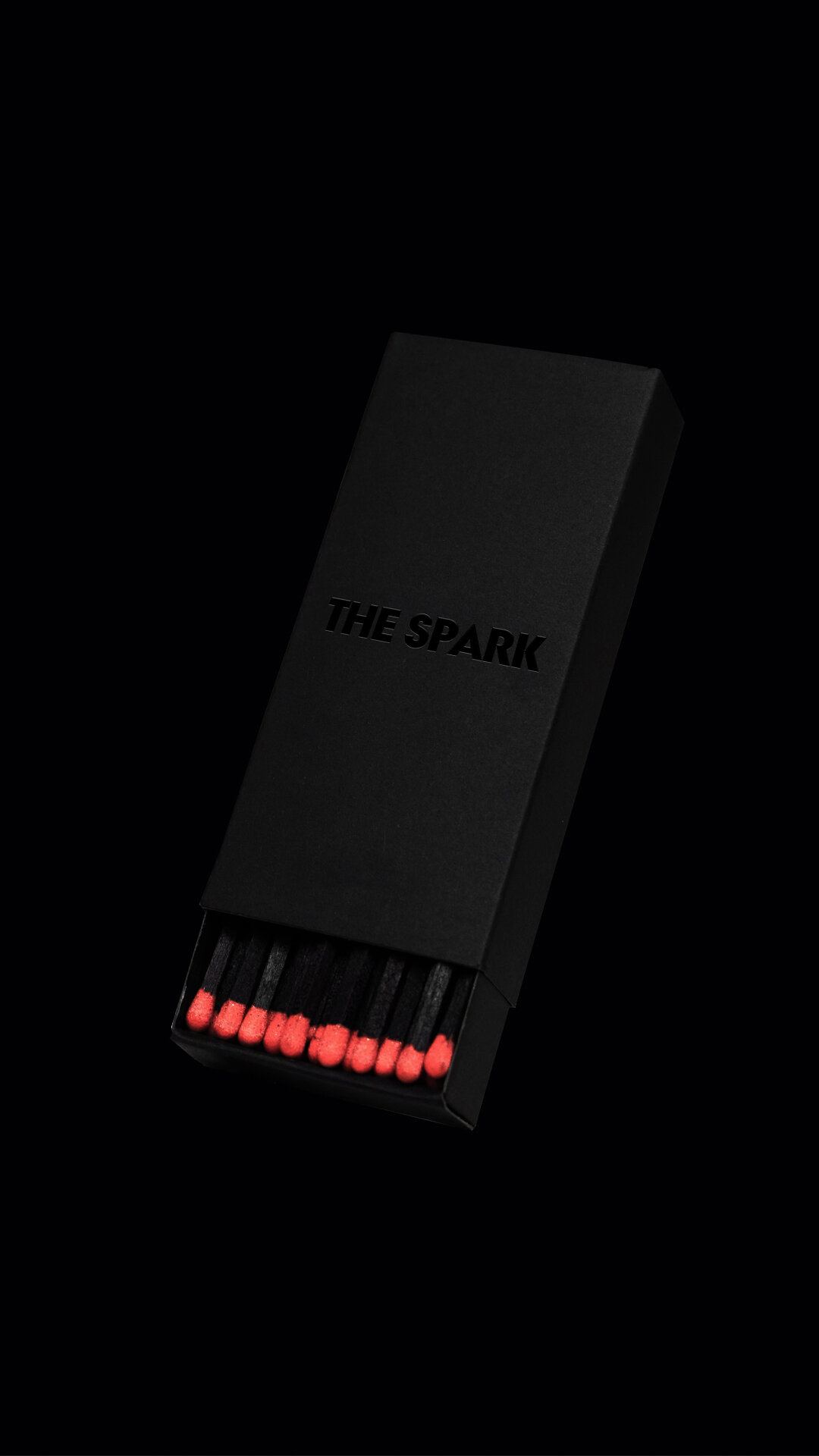
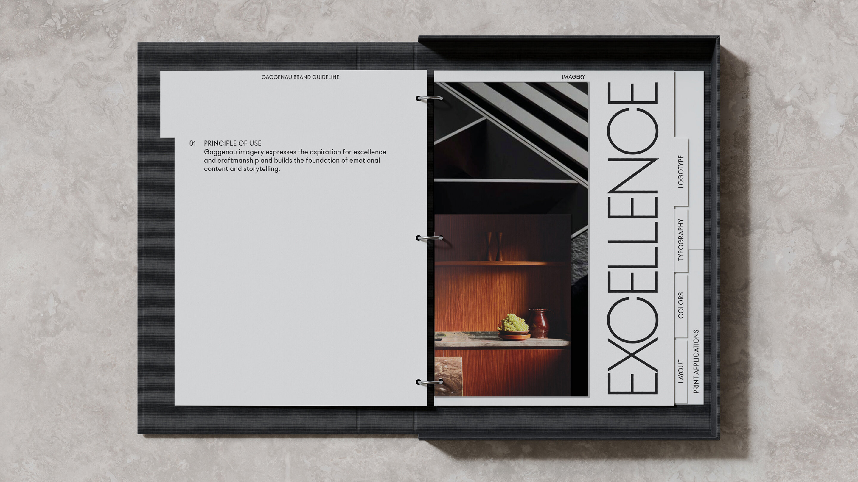
We established a new normative framework for the luxury brand Gaggenau, refining its profile within the B/S/H conglomerate. Building on this foundation, we developed a distinctive brand design—from an elegantly refined logo and a bespoke typeface to carefully curated imagery. We helped shape a clear and compelling identity for one of Germany’s oldest and most prestigious brands, elevating an oven from a premium appliance to a true status symbol.
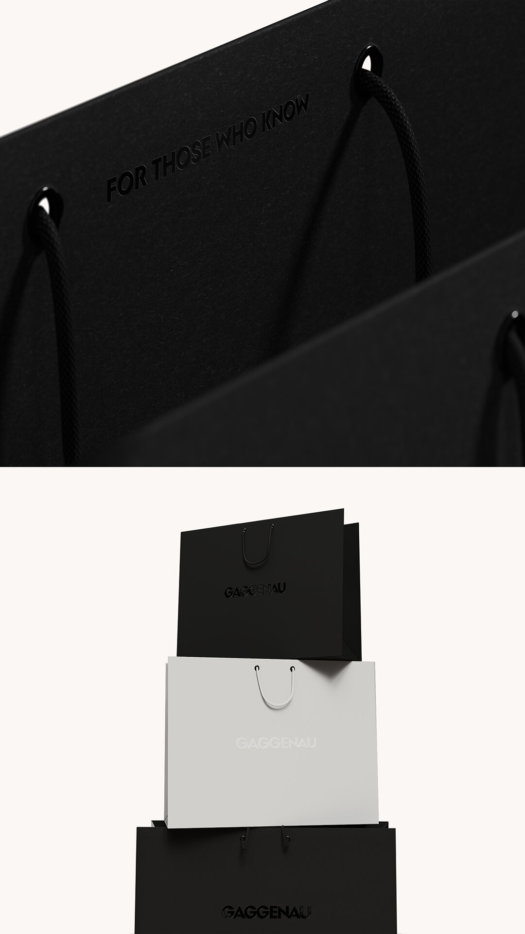
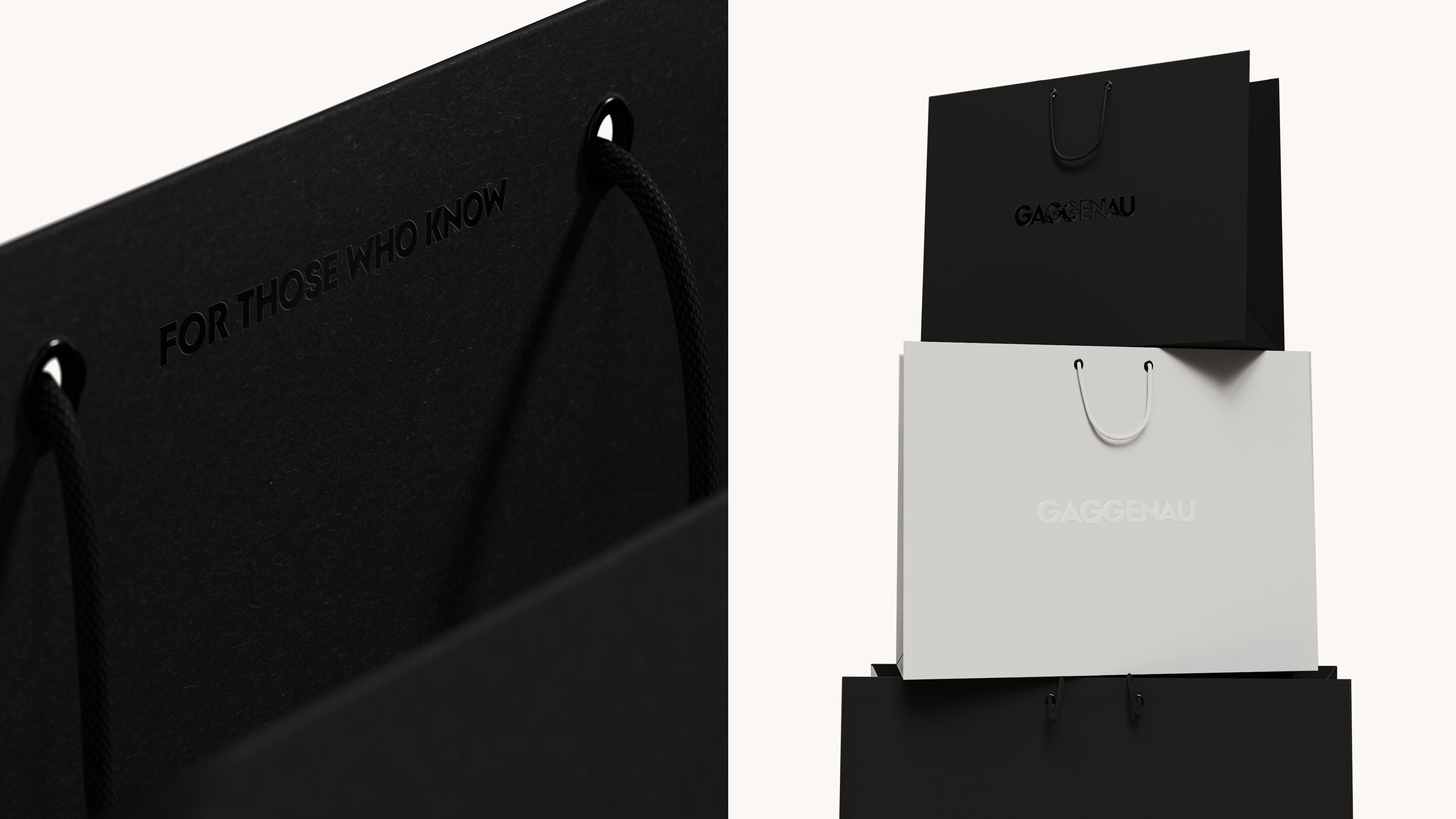
For those who know
In a world of abundance, the ability to recognize true quality elevates our existence to a higher level. Gaggenau’s design philosophy is deeply rooted in the Bauhaus tradition, embodying precision, functionality, and timeless elegance. We have created a future-proof design system that honors the brand’s heritage while setting new standards for adaptability and expression.
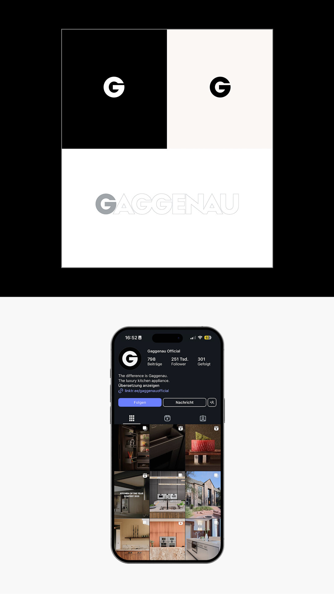
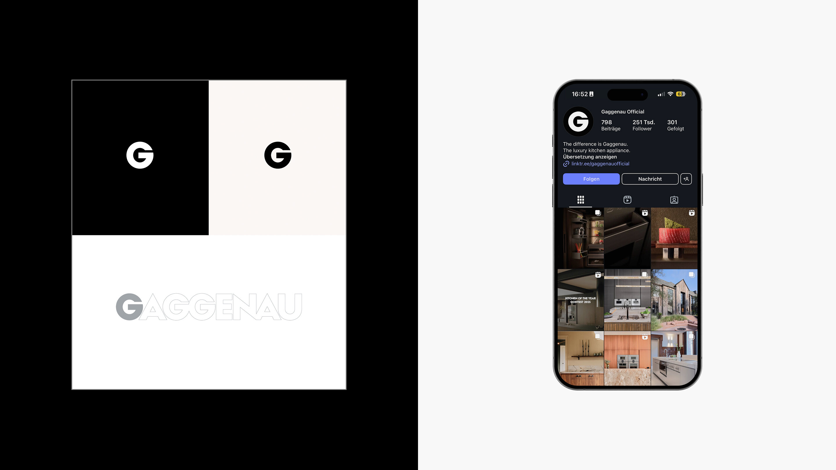
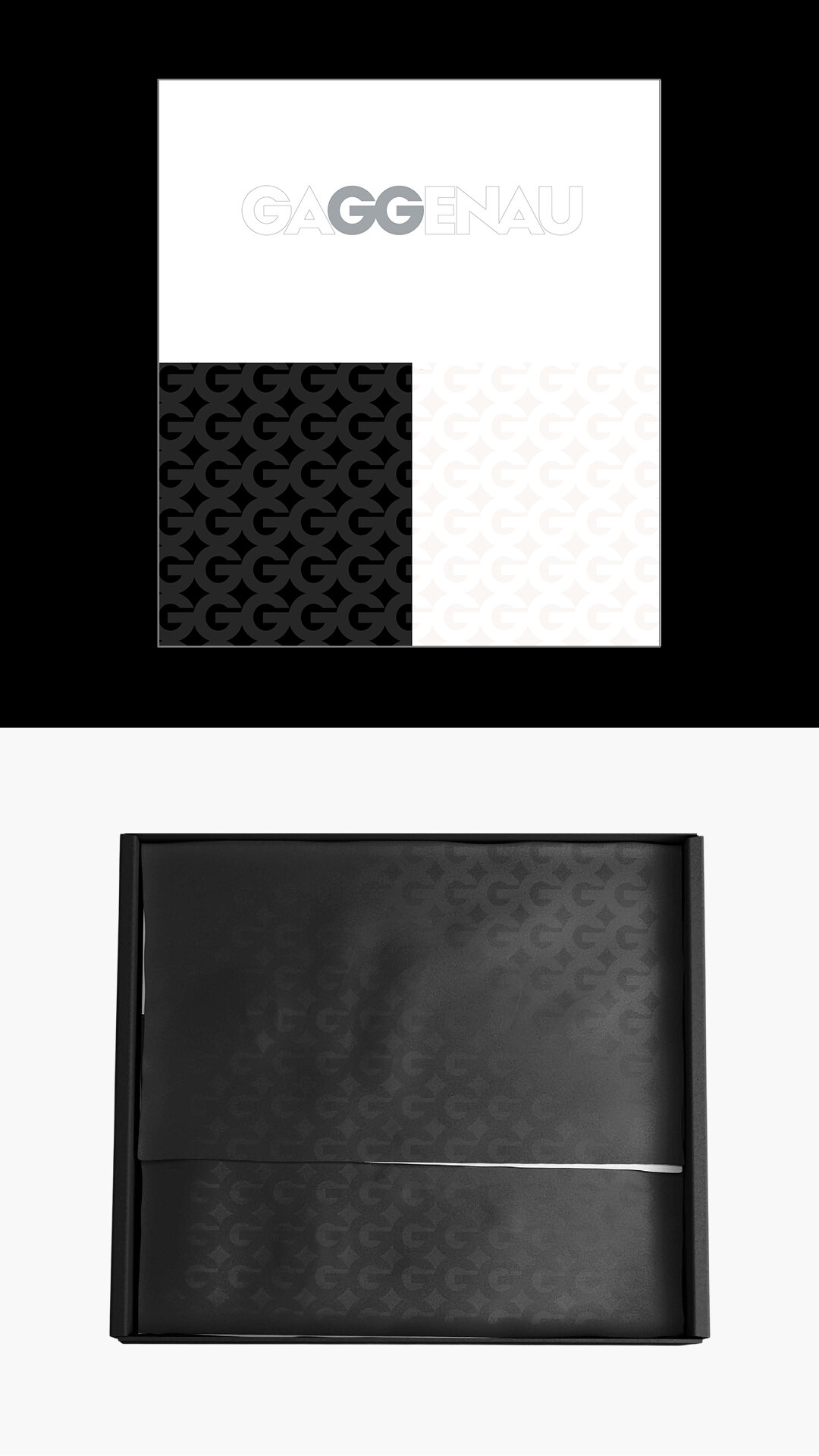
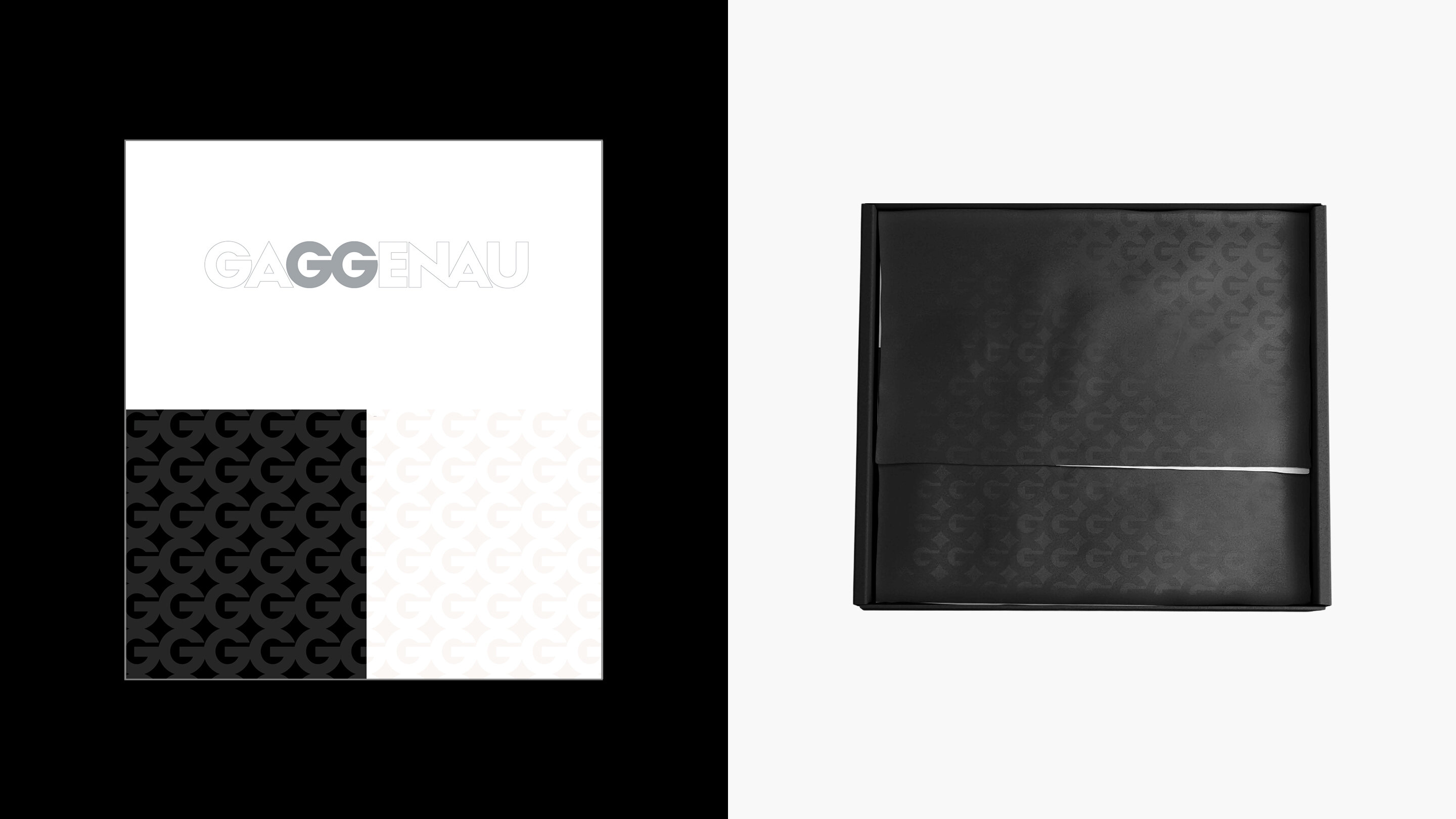
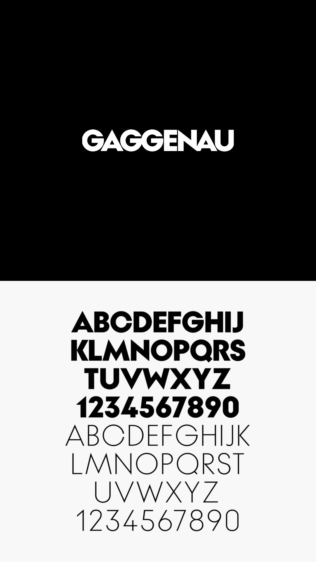
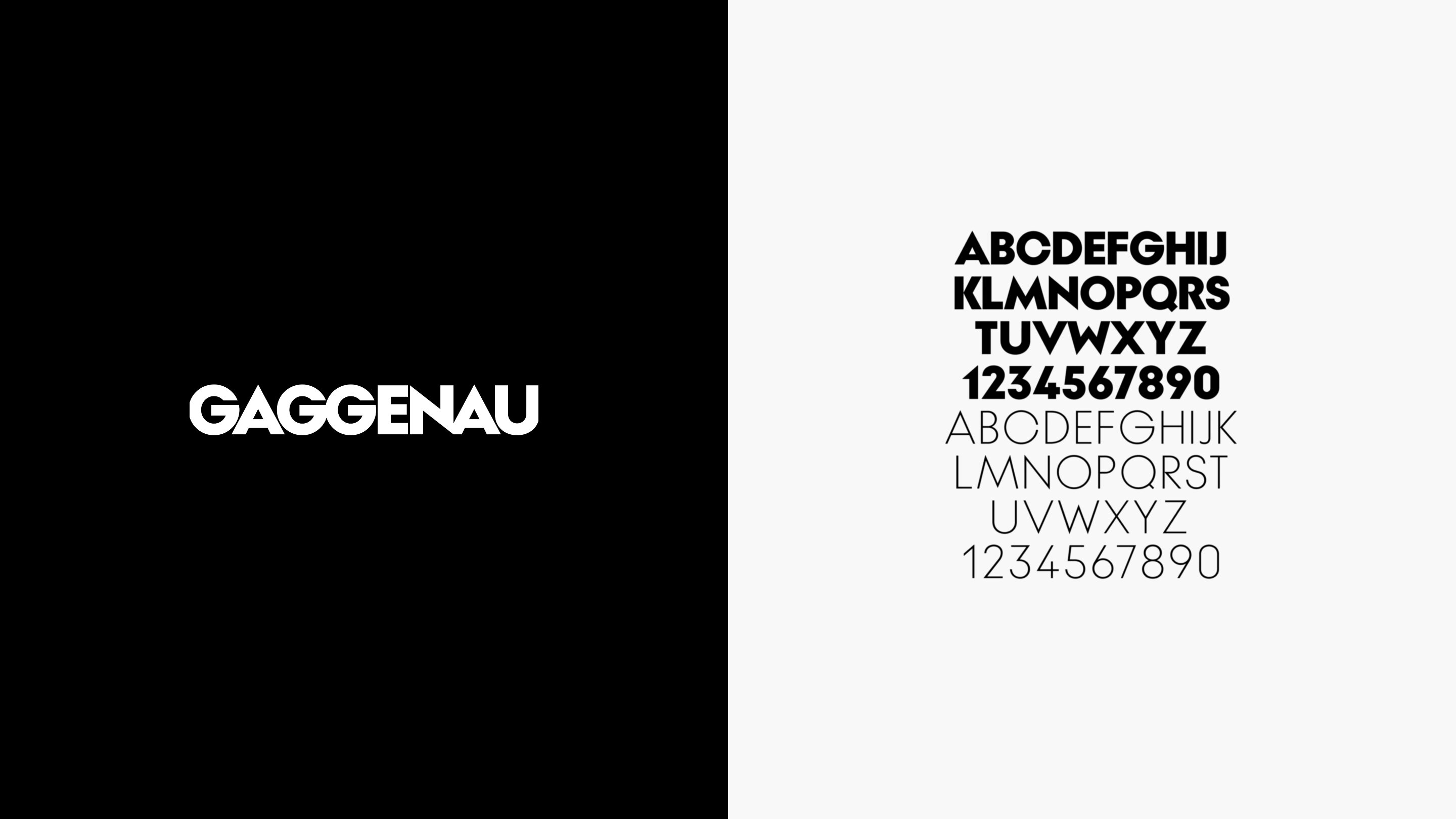
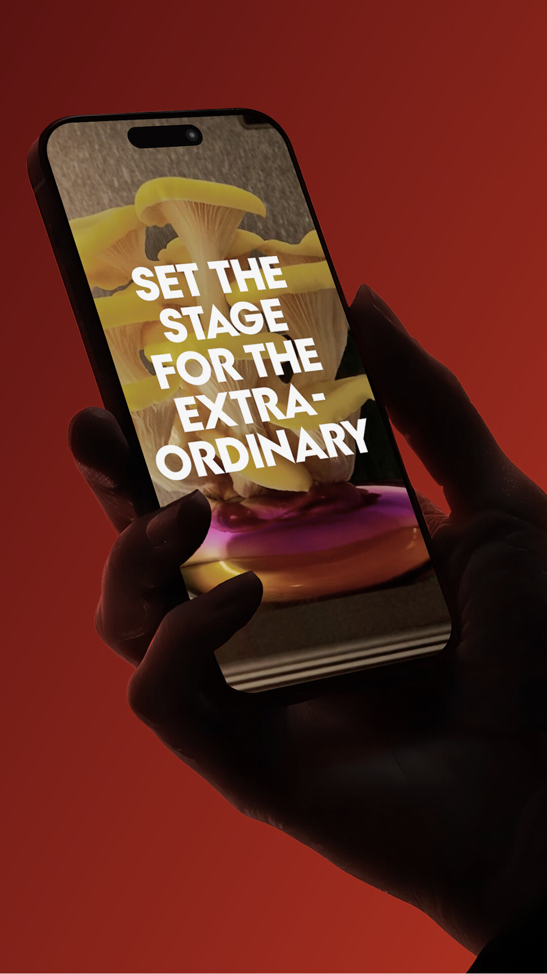
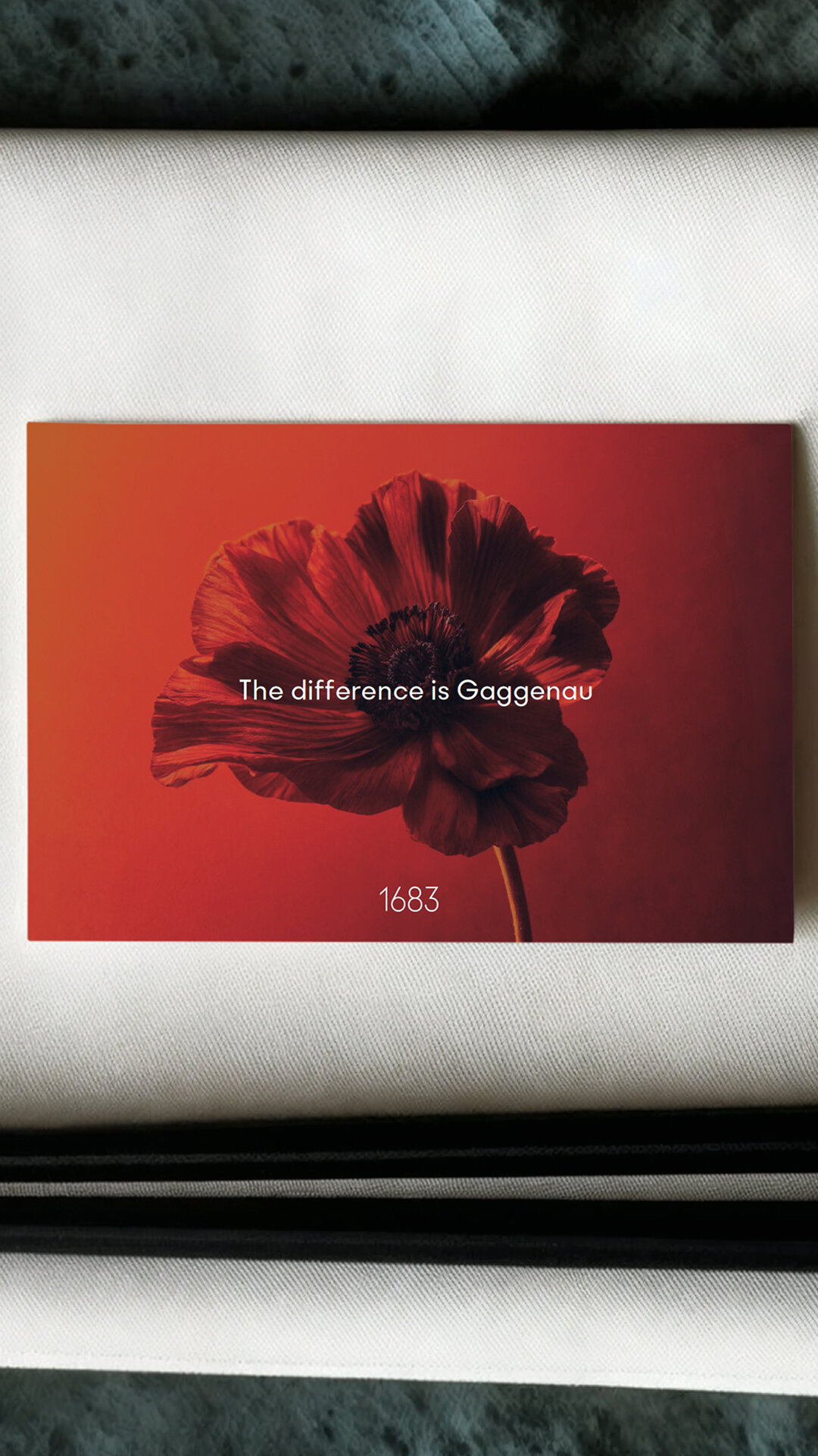
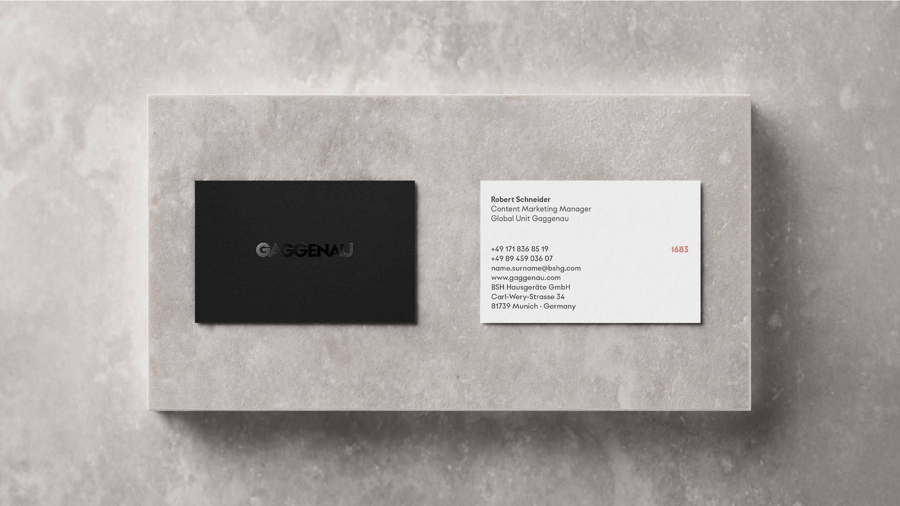
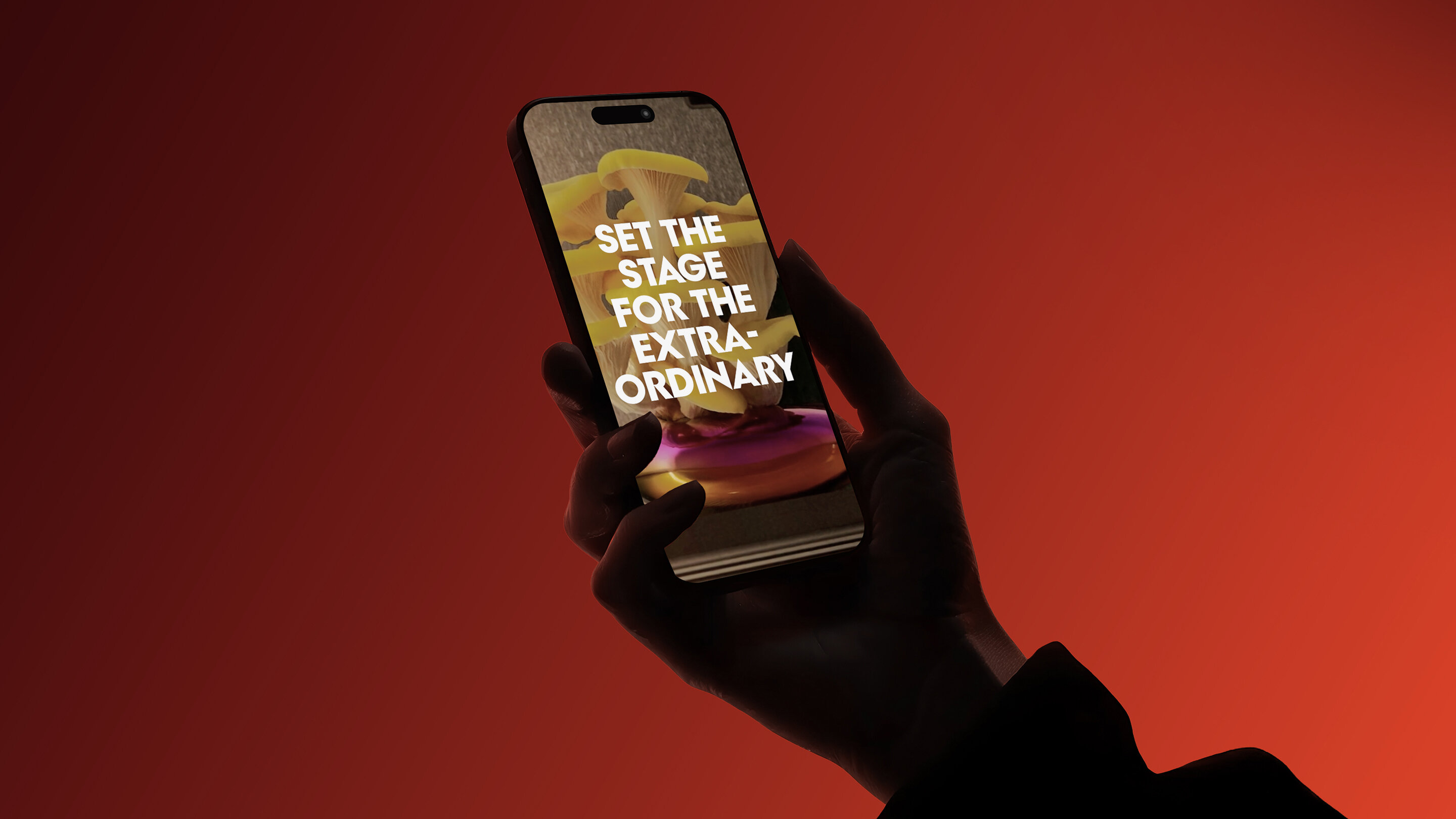
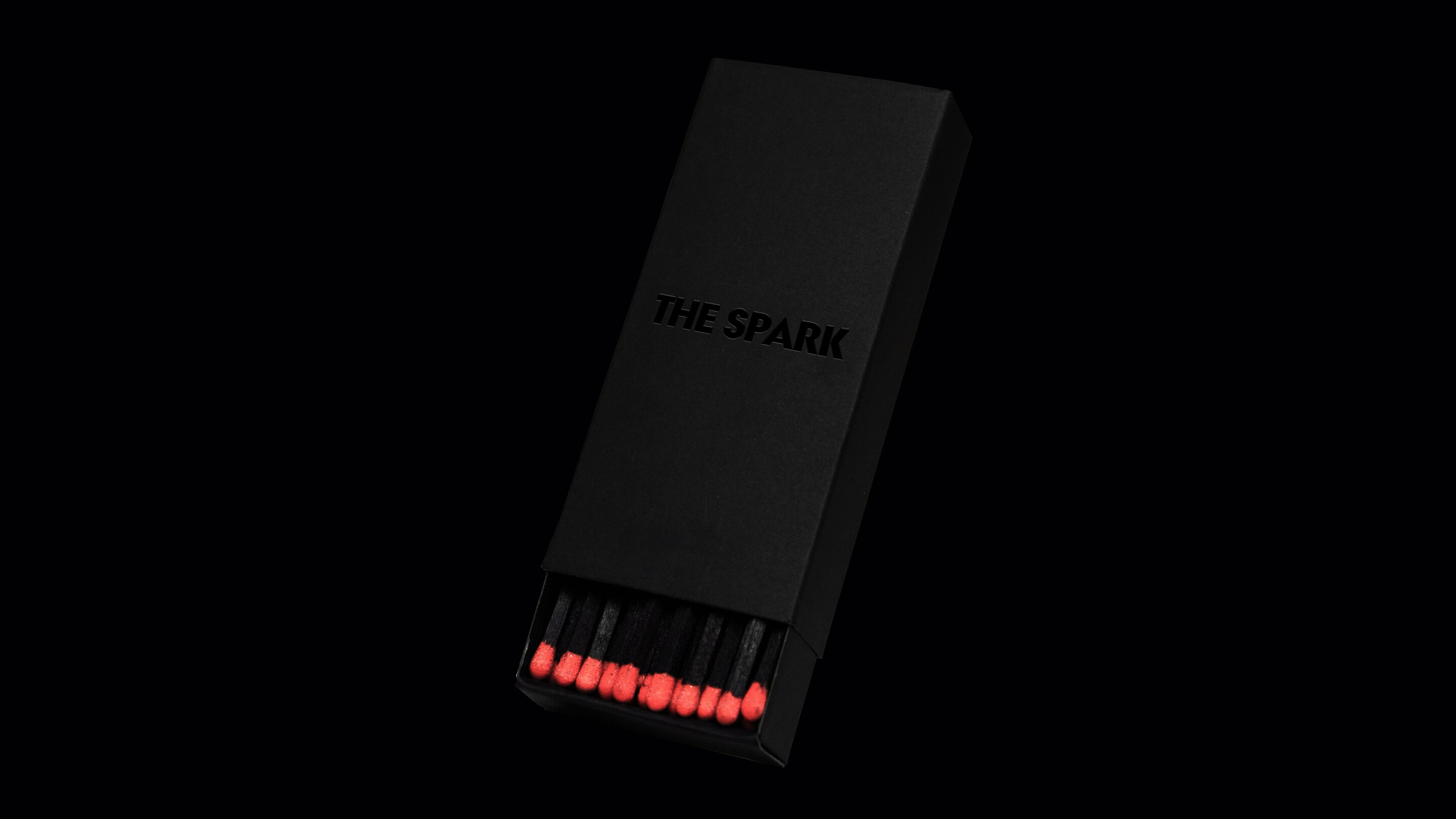
The refinement of the bold, timeless logo forms the foundation for a cohesive typeface, enhancing typicity and recognition. A versatile logo system, including the iconic wordmark, monogram, pattern, and consistent use of the Gaggenau claim, acts as a dynamic and adaptive toolbox for diverse applications. A minimal yet emotionally resonant color scheme reinforces the brand’s identity, with a vibrant accent color adding a bold new dimension—sparking emotion as Gaggenau continues to shape the kitchen as a living space.
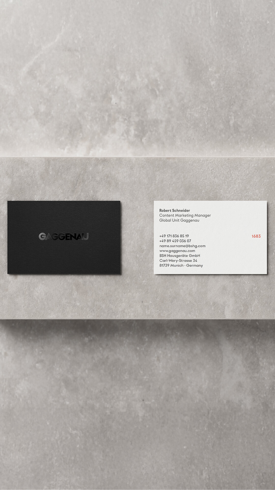
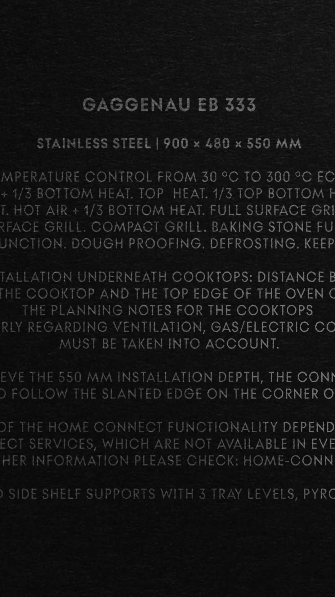
Subtle yet sophisticated, these design principles establish a coherent foundation across communications, user interfaces, and both online and offline applications—crafted for those who truly appreciate excellence.
